A sideways look at economics
I’m sure you’ve heard the age-old phrase every economics student past and present can recite: “Correlation does not imply causation”. Cause and effect between two variables cannot be deduced purely on an association between them. That’s why when we plot two variables, such as the number of people who drown after falling out of a fishing boat and the marriage rate in Kentucky, or US crude oil imports from Norway and drivers killed in collisions with railway trains, we can get bizarre examples of a phenomenon called spurious correlation. It would be entirely misleading to associate a relationship just because two sets of data correlate on a chart. This is just one example of many bad habits people make presenting data. In fact, I’ve seen so many bad charts in my short career that I’d go as far as saying “Most charts suck”.
You don’t have to look far to find examples of forced correlations, truncated axes, confusing use of colours, mis-used chart types, difficult-to-read labels, etc. Many of us will be guilty of these transgressions, and I’ll confess I’ve sinned in charts more than a few times myself.
Nonetheless, there is an increasing awareness that how we present statistics and data analysis can be misleading. You may already be familiar with the field of ‘data visualisation’. This is the practice of ensuring that the graphical representation of information and data through visual elements, like charts and maps, is accessible and based on true patterns within the data.
Hans Rosling, the Swedish physician and academic, first opened up to me the possibilities in this field with his startling ability to tell rich stories with data. Rosling passed away in 2017 but left behind an incredible legacy, as an advocate both for fighting misconceptions about data and for using the power of data visualisation to inform people about international development and healthcare. He had a natural ability to educate, and combined this with dry humour and enthusiasm for his subject.[1]
Here at Fathom, we also believe in telling the truth as we see it. Combining our expertise in economics, finance, and geopolitics with data visualisation techniques, we hope to share information and ideas with the world in clear and concise ways. It can often be difficult to get this right when we’re dealing with complex data sets, or deriving insight from many hours of research and consultancy work. How can we summarise the flows of thousands of Chinese global M&A investments, or understand how conflict risks are geospatially distributed in Africa, or assess country-level risks of sovereign, banking, and currency crises, for example?
Focusing on the latter, one of Fathom’s proprietary tools, the Financial Vulnerability Indicator (or FVI for short) recently provided the data team with an exercise in visualising a novel dataset. Here I’ll walk through some of the considerations we had to take into account when digging into the data.
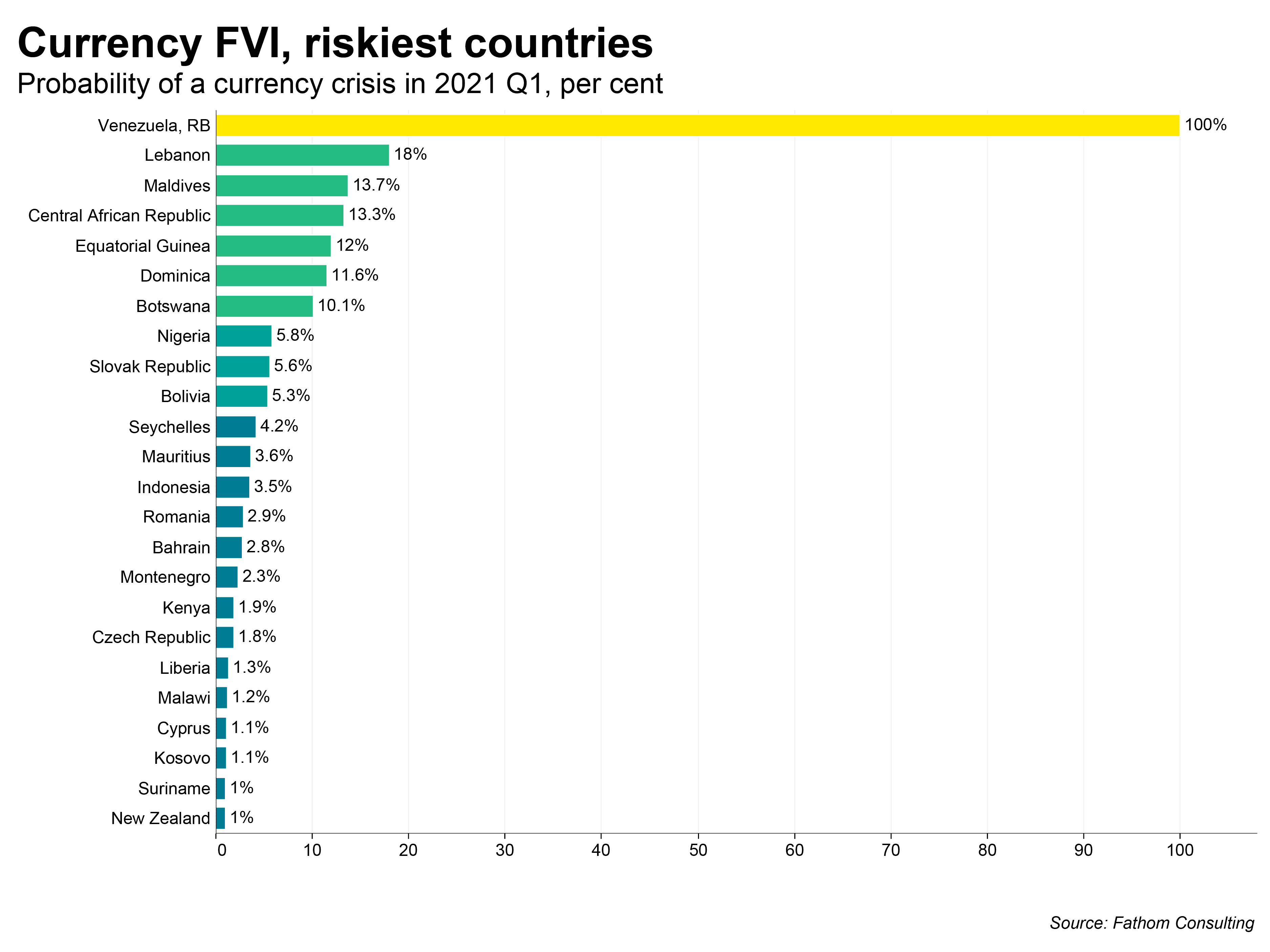
The FVI estimates the probability of a banking, currency, or sovereign crisis occurring in a country during a given time period. Because crises, by their nature, are not events that occur frequently, the dataset is positively skewed, which means there are more observations towards the left-hand side of the distribution than there are on the right. This means most countries have a low probability of entering a crisis in any given quarter.
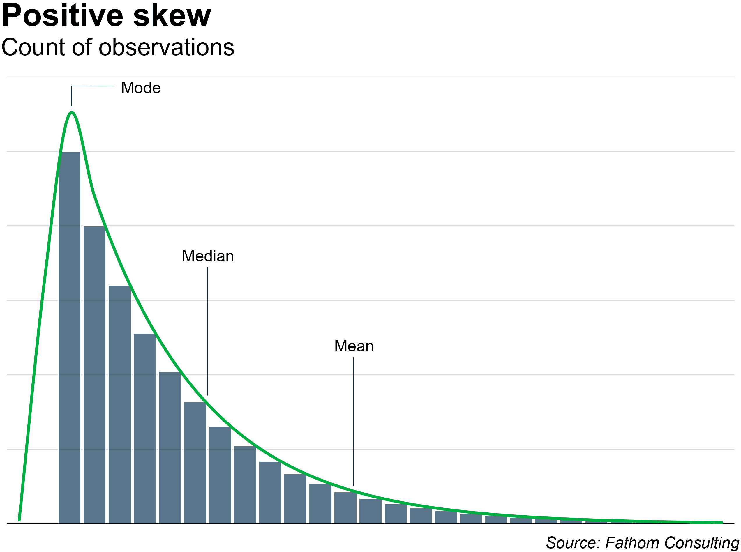
If we were to plot these data on a choropleth map and colour each country by its probability of crisis on a linear scale we would find it very difficult to pick out anything but the extremes in the dataset. For example, in the chart below, you will observe that our Currency FVI flashes bright yellow for Venezuela, as the country is in the throes of a currency crisis in 2021 — ranking at 100% probability in our dataset. What’s not so evident from the map are the differences between low-risk countries such as the United States, with a probability of 0.1%, and higher-risk countries such as the Central African Republic, with a probability of 13.3%; middle-ranking countries like Slovakia, where the risk of a currency crisis in 2021 Q1 stood at 5.6%, also fail to stand out.
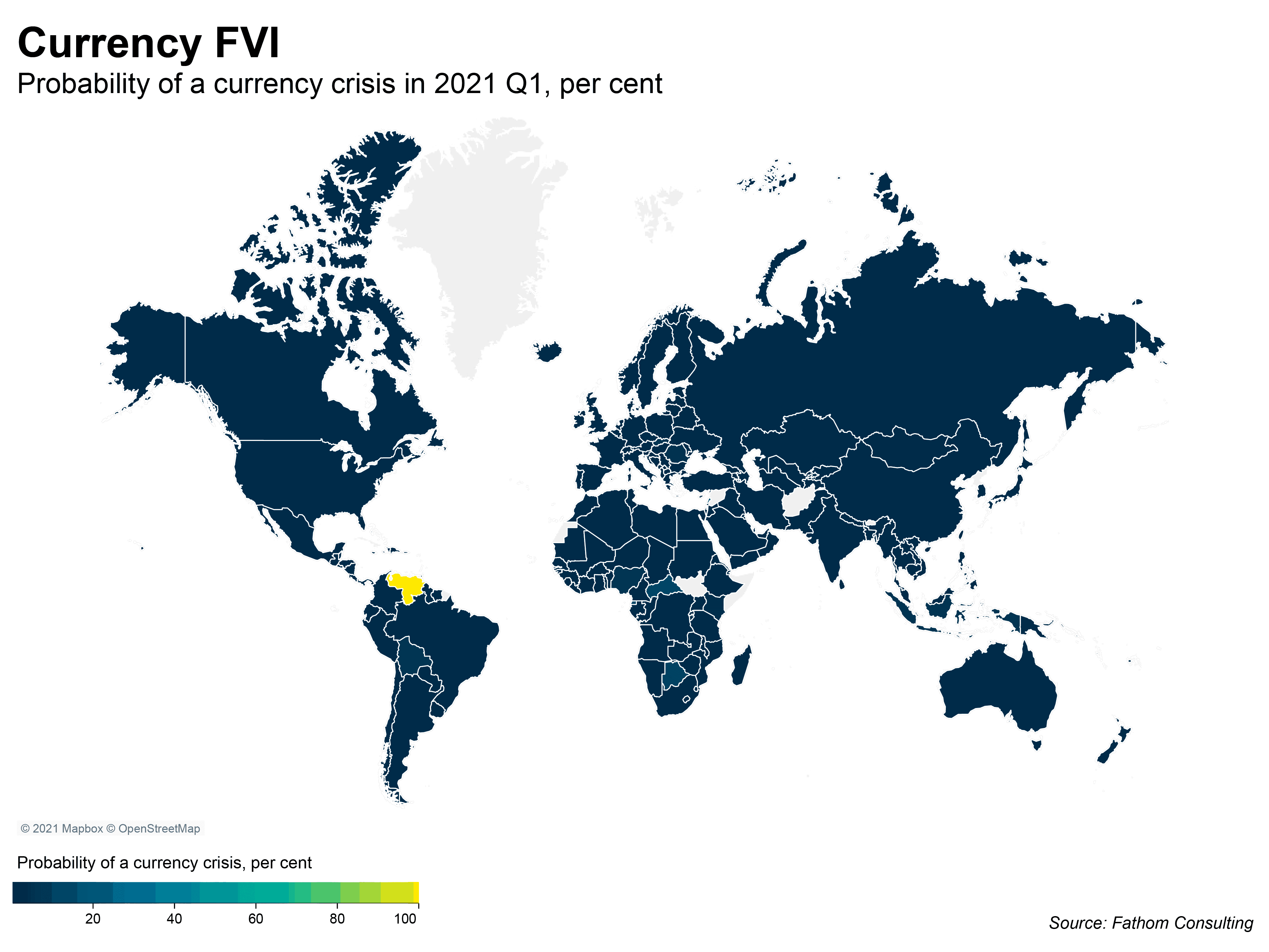
It’s important that the viewer can identify these values, not least because the difference between a country’s risk of crisis at 0.1% and 6% is meaningfully distinct. Real-world impacts for our readers’ businesses and organisations, be those financial or strategic or other, rest on the correct assessment of and response to these risks. The linear colour scale for the choropleth map fails to draw attention to these subtle, but consequential, differences in the FVI.
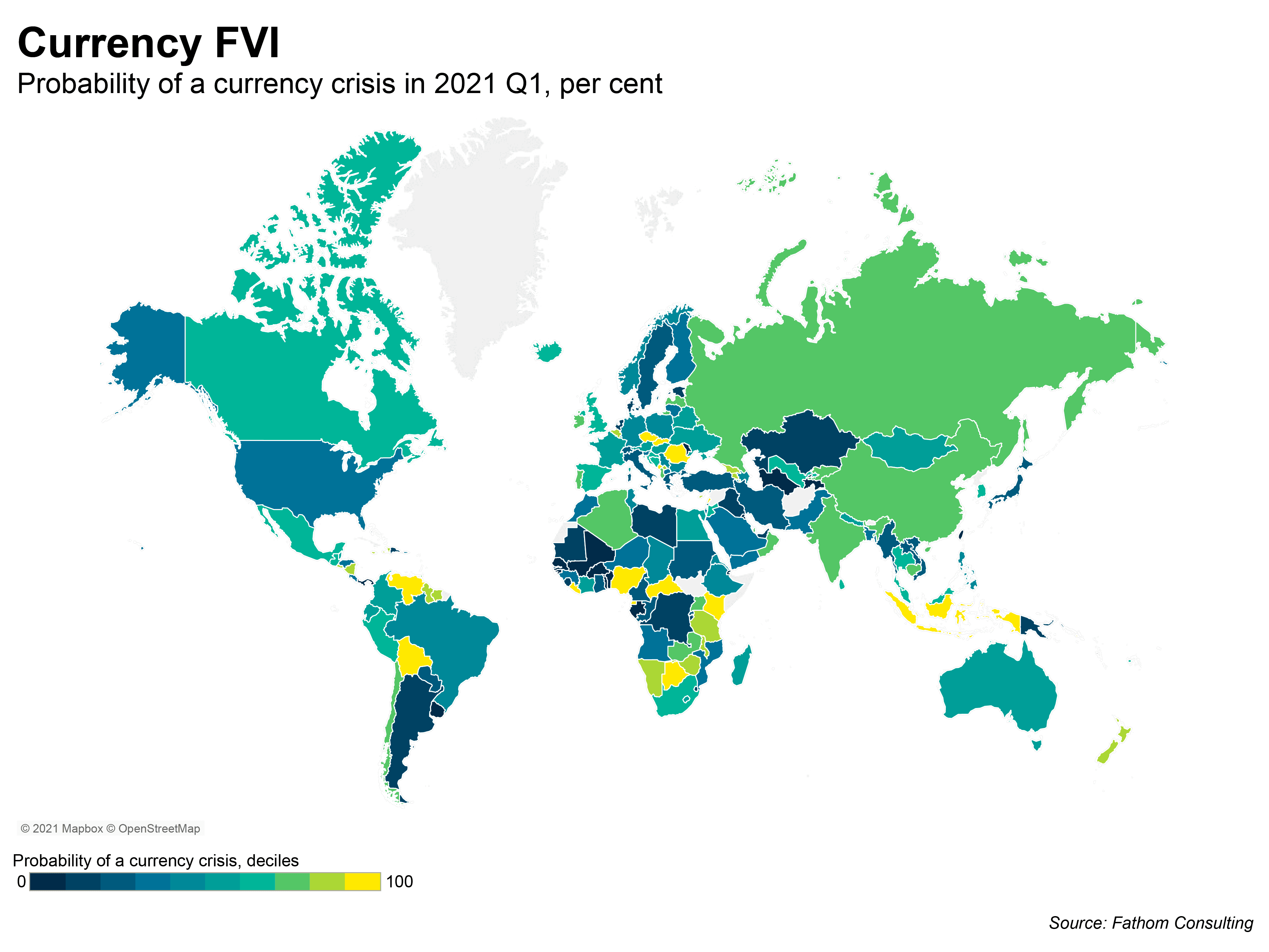
One solution we tried was to plot the percentiles that the probabilities fall within, and divide the colour scale into deciles. In the second map you can immediately see the stark difference between this method and the first. Using deciles allows us to get an impression of the distribution of the data: the yellow countries are relatively riskier when compared to their neighbours. Grouping countries into these deciles helps us quickly to identify the countries that have relatively high probabilities of crisis compared to their peers.
However, this method does not help to identify within-group variations. To identify absolute differences in risk profiles, a more nuanced approach is needed. After some deliberation, we coded the choropleth’s colours to use a logarithmic scale. This presented us with a little too much colour variation between the lower end of the distribution, so the map below uses an adapted version where we simplified these colours into buckets to help the viewer to understand the range of values.
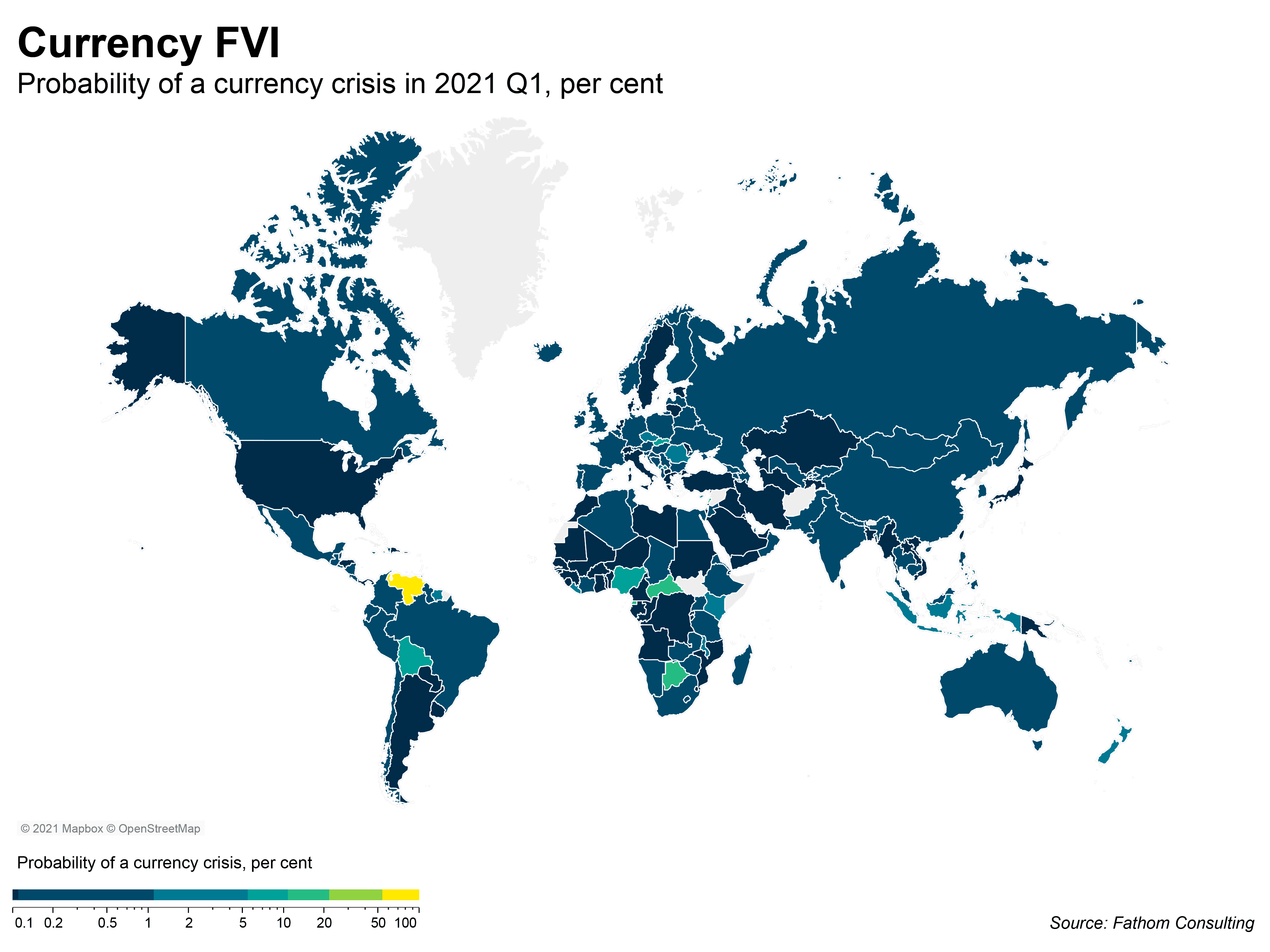
But how good is your knowledge of nation states? Can you identify the country which ranks in the 10-20% band in Southern Africa? Kudos if you can, but not every viewer is a geography nerd who can successfully name all the countries in the world.[2] Moreover, could you tell me what the Maldives probability was in 2021 Q1? Anyone lucky enough to have visited knows there’s just enough room to fit an airport onto the islands. You just can’t see this sort of detail on our world map.
So, what’s the solution? The answer very much depends on the context of our work. World maps are incredibly popular with viewers despite their well-documented problems. They tend to function best when accompanied by tables and other charts which bring out stories within the data, and work well in interactive environments where users can read tooltips, filter data, and zoom in to gather more detail. We often use maps in Fathom’s dashboards to help provide an overview for users, to allow them to begin asking questions about our data sets and provide a starting point for drilling down into different visualisations. For a research piece though, a ranked bar chart might offer a cleaner look at a subset of the data.
Ultimately what matters is the approach. At Fathom we aim to create clean, well-formatted, easy-to-understand charts, with appropriate use of colours, fitting to the story we are telling — and sometimes that means producing a ‘boring’ chart. However, getting the fundamentals correct means our readers can fully comprehend our analysis. Every once in a while a data visualiser gets the chance to create something really special, like Hans Rosling’s 200 Countries, 200 Years, 4 Minutes chart — and when you do, you can be proud of it, knowing you’ve followed in the footsteps of the man who made data sing.
For more information on Fathom’s FVI, including discussion of our latest 2021 dataset and forecasts through to 2022 Q2, please email enquiries@fathom-consulting.com
[1] Unafraid to emphasise his points using physical actions when presenting, Rosling was known to climb up on stepladders to get closer to the data, and make use of a home-made three-metre stick with an arrow on the end to point at his charts on big screens.
[2] While interning in the Country Credit and Political Risk department of an insurance firm as an undergraduate, my manager would challenge me to name all the countries in the world within 15 minutes. Each week if I met his goal (80%, 85%, 90% etc.) he’d treat me to a Friday lunchtime burrito from Leadenhall Market. Drop me a line if you can get over 70% on a casual run (https://www.sporcle.com/games/g/world), or if you just really love the burritos at Leadenhall — they’re worth raving about!