A sideways look at economics
It is strange what a difference one small, apparently insignificant change to the way things are measured can make to an overall finding. This realisation came home to me when I was reading about the resident doctors’ pay grievance. The resident doctors have a clear narrative about the way their pay has been eroded. Their union, the British Medical Association (BMA), has published the following chart to illustrate it. One thing in the chart title caught my eye: the chart was made ‘using RPI inflation’.
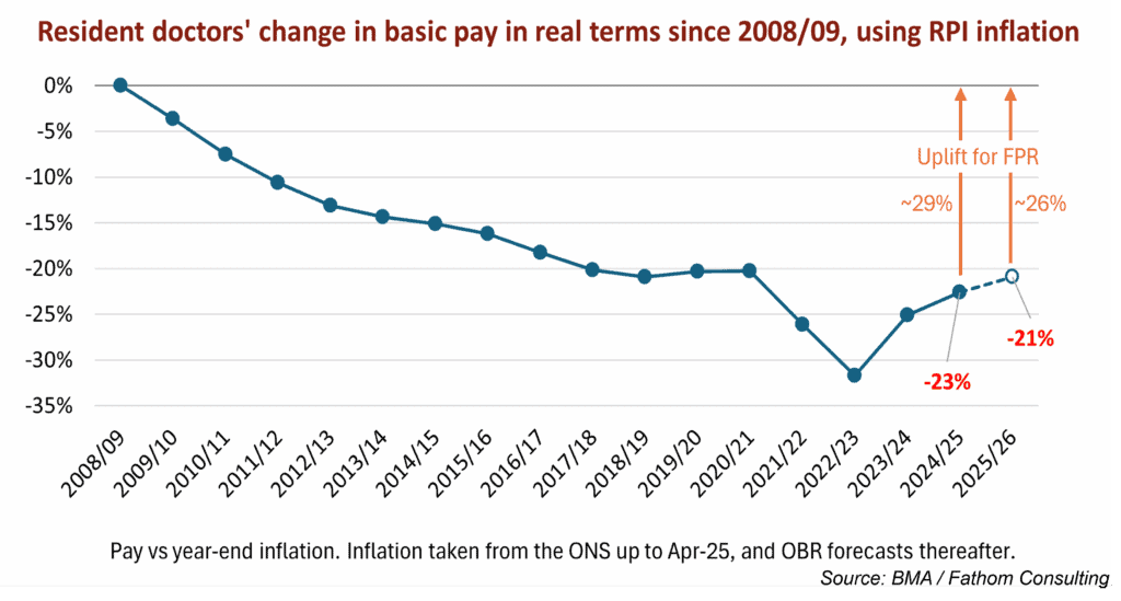
Every media interview given by a striking doctor in support of their pay action has referenced the information in this chart.[1] Spokespeople quote a precipitous decline in the value of doctors’ pay between 2008‒2024, and a yawning deficit that apparently still exists today, despite the 22% pay settlement Labour gave resident doctors last year in an attempt to end the dispute. Photos from the picket lines outside hospitals show placards protesting at “Cuts so deep not even a surgeon can fix it” and claiming a “26% sale on underpaid & undervalued junior doctors”.
I (in common with approximately 99.3% of the UK population) do not have a degree in economics, so while the choice of RPI over the more commonly used CPI inflation measure flagged as odd, it did not appear necessarily suspicious. My view started to change when I read on the Office for Budget Responsibility’s website that RPI “is typically higher than CPI inflation, with the difference between the two measures described as the ‘wedge’…” Reading on, I found the OBR had previously estimated the wedge “to be around 0.9 percentage points in the long run”.[2]
Did that mean 0.9 percentage points over however many years the OBR regards as the long run, or was that 0.9 percentage points a year? (Fathom economists have had to get used to their editor asking this kind of dumb question, and have been patient with my ignorance.) It turns out that it meant 0.9 percentage points a year. What difference might that make to the BMA’s chart on the degradation of resident doctors’ pay in real terms?
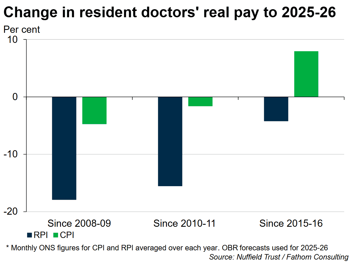
Quite a lot, as it turns out. The Nuffield Trust, an independent health think tank, has pulled together a chart based on what difference it makes when you deflate resident doctors’ pay by CPI as opposed to the RPI measure — we reproduce it below. Sticking with the BMA’s preferred starting point of 2008 (a loaded choice, since this was the start of the Global Financial Crisis, when measures of pay and personal financial wellbeing started to go south fast), and based on the Nuffield Trust estimates of headline pay settlements for resident doctors,[3] it appears that doctors’ real pay has fallen by a less shocking 4.7% since 2008. In fact, if you compare resident doctors’ pay between 2015–2025 — and every resident doctor currently striking is likely to have joined the profession since 2015 — on the CPI measure their pay has risen by 7.9% in real terms. As every economist knows, it really does matter where you start your data series. Arguably a more accurate story of resident doctors’ pay over the last decade is one of doing rather better than the rest of the population, as I’ll come to in a moment.
This is not going to look quite so impressive on the strike placards. I doubt we’ll be seeing posters any time soon that say ‘Cuts so deep that this year’s 5.1–6.3% pay offer — that the Doctors’ and Dentists’ Pay Review Body recommended and the government accepted in full — would completely fix (but we still rejected it)’, not least because it is clear the resident doctors passionately believe that they have been grievously mistreated. They are doctors, not economists — why shouldn’t they trust their own union?
I am left wondering whether the BMA campaigns department knows it is being disingenuous with the statistics. It is hard to blame a union for being one-eyed in the pursuit of its members’ interests. On the other hand you would hope they would draw the line at soliciting 23 separate strikes, each costly to the creaking NHS and with the potential for harm to patients, on the justification of pay erosion that vanishes if you look at it using a different statistical measure.
Despite the flawed statistics you could forgive the doctors’ vehemence if they had felt left behind because real pay amongst the rest of the UK population had been racing ahead since 2008 — but it hasn’t. Average UK weekly total earnings (i.e., including bonuses), as recorded by the ONS, remain slightly below 2008 levels in real terms, as the chart below shows. Unless we have been promoted or work for an employer that awards an annual pay increment for experience, we are all still able to afford nothing more than the same package holiday we bought in 2008. (If you were looking for a driver for mounting dissatisfaction with UK politics and politicians, in my view that might not be a bad place to start.)

It appears that to award the resident doctors their current pay demands of around 29% on top of last year’s 22% would put them dramatically ahead of the curve and would be unjust to other workers. The passion with which the resident doctors continue to pursue their pay grievance irrespective of natural justice seems a symptom of our post-modern, post-fact age. We all have our own version of economics that serves ourselves, whether sincerely believed or consciously adopted. Wes Streeting could decide to give them a rise out of sympathy, because rising demand for NHS services is making them work harder, but then the nurses (who haven’t had a 22% pay rise) would justifiably complain it was unfair. And overall productivity levels in the NHS — the one thing that could justify substantial pay increases — are barely improving and remain below pre-COVID levels.[4]
It’s likely (again, speaking as a non-economist) that the ignorance of 99.3% of the population about economics basics, coupled with the loss of credibility of the mainstream media, makes us all more vulnerable to alternative economic facts, especially when they come clothed in plausible arguments and loud shouting. When wondering if the resident doctors deserve a rise (or why we ourselves feel poor) it can feel as if there is no authoritative source of information. The economic narratives that each of us chooses often depend heavily on subjective judgements influenced by our emotional state, such as how financially secure we are feeling, how strong the current challenges are to that security, and whether we feel some other group is doing better than us. We are at risk of being led off track. Thank goodness there is Fathom for a roadmap.
[1] The chart is based on this briefing paper: bma-ia-pay-restoration-methodology-13-september-2022.pdf
[2] Also noteworthy — the OBR feels the RPI measure “does not meet international statistical standards” and it is being phased out from official usage by 2030. The BMA points out that many resident doctors have large student loans and that for the time being interest on these is still calculated using RPI.
[3] According to the Nuffield Trust, the average wage of the most junior resident doctor (in Foundation Year 1) is £45,900 in 2025/26, comprising basic pay of £38,800 plus roughly 20% extra in anti-social hours allowances and cost-of-living weighting. In May 2025, average gross weekly earnings for UK workers were £722 (total pay), the equivalent of £37,544 a year.
[4] NHS England » NHS productivity
More by this author