A sideways look at economics
Since I moved to London, I’ve noticed planes flying over my head quite regularly. Probably most Londoners pay no attention to it, but I guess the aerophobia I’ve always suffered from makes me especially aware of their presence. Inspired by this, I decided to look at some statistics for London airspace. Could this data also be helpful to predict economic activity?
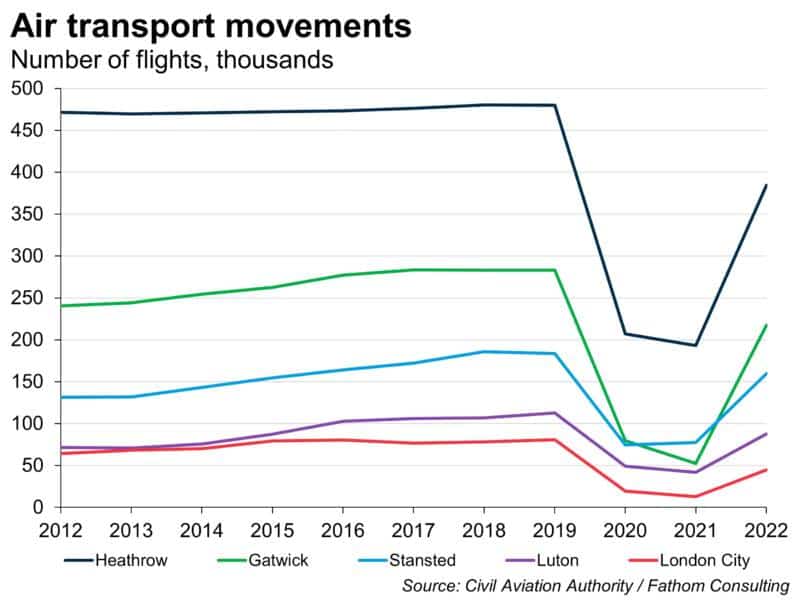
Given the size of London and its global importance as a financial, educational and tourist hub, it comes as no surprise that the city experiences hectic flight activity throughout the year. Preliminary data from the Centre for Aviation shows that London was the city carrying the highest number of air passengers in 2022 worldwide, followed by New York. By number of flights, Heathrow is the UK’s biggest airport, followed by Gatwick, Stansted, Luton, and London City. This ranking has remained relatively stable over the past years and, as we can see in the chart below, none of them has recovered pre-pandemic numbers yet. Doing the maths, the total number of air transport movements[1] in London in 2022 was 894K, which gives me an average of 74.5K per month, 2500 per day, 102 per hour and 1.7 flights per minute!
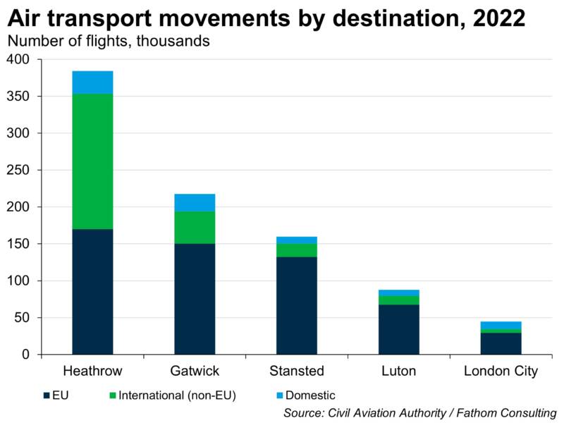
In terms of the destinations of these flights, the picture is also quite interesting. Heathrow is, by far, the most important airport when it comes to non-EU international flights, which account for 48% of its Heathrow’s total air traffic, followed by a long distance by Gatwick (20%). EU flights account for the majority in all airports except Heathrow, while London City Airport has the highest relative importance when it comes to domestic flights in and out of London (23% of all flights out of that airport are to UK destinations). If we differentiate between passenger and cargo flights, all airport statistics show that cargo flights account for only a very small percentage of their business: Gatwick and London City do not have cargo flights at all, with Stansted being the busiest cargo terminal, accounting for just 6.2% of its flights.
Despite the very high number of flights, airplane accidents are in fact very rare. According to the UK Department for Transport, the annual number of fatalities by air in the UK was just 0.01 per billion passenger kilometres between 2011 and 2020, compared to 0.4 for boat transport, 1.1 for cars and 67 for motorcycles.[2] Believe it or not, my little obsession with planes led me many years ago to create a comprehensive database with the total number of flights I’ve ever taken (and it is further broken down by destination, airline, and reason for the trip). Since I jumped on a plane for the first time in 2002, I have flown 102 times, which gives me an annual average of almost five flights per year. Assuming this trend continues, I should expect to die in a plane crash in 753,000 years’ time![3]
This incessant coming and going of planes that I talked about also got me thinking about how one could somehow use real-time air traffic data for estimating current economic conditions. After all, the aviation sector is very important in driving GDP, accounting for 3.4% of GDP in the UK[4] through both direct (aviation sector output) and indirect effects by facilitating the growth in other sectors, such as tourism. However, official statistics for flight volumes in the UK are published with three months’ delay, making it very difficult for policymakers to have a real-time assessment of the economy using this data.
The good news is that, in a recent paper,[5] researchers from the Warwick Business School tackle this issue by constructing an alternative database for flight volumes using real-time aircraft location, available thanks to the Automatic Dependent Surveillance-Broadcast (ADS-B) technology, which determines an aircraft’s position using satellite navigation. In their study, they first show that this alternative database correlates very well with official statistics, with the added advantage that it is available in real time. In a second step, they use this data to produce a “nowcast” (real-time estimate) of the contribution of aviation to GDP, finding that the data is indeed a leading indicator for economic activity relative to a benchmark model.[6] The most promising finding is that this model performs especially well during volatile periods, such as the global financial crisis of 2008. What this means in practice is that, if the authorities had had this model at hand back then, nowcasts would have shown a fall in the contribution of aviation to GDP before the crisis started, allowing them to anticipate the event and formulate a quick policy response. However, the researchers also flag that to build a more complete picture of the economy, this analysis should be expanded to other sectors in which data is available at a similar level of granularity.
So, what do the aviation data say – are we in for a recession or not? Well, sorry – I can’t tell you. Not because I don’t want to but because you need a model to crunch the ADB-S’s real-time flight data, and I don’t happen to have one. But at least thanks to the Warwick researchers we now know that when such a model does come onstream, my theory will be vindicated, and it will be useful for economists to consult.
After looking at all of these interesting flight data, you may well think: “Juan, get over it already!”, and I will not blame you for that. However, no matter the number of planes I see every day flying over my head that manage to land safely, or how many statistics or pieces of evidence you show me, it always scares the hell out of me when the captain pronounces the words: “Cabin crew, ready for take-off!”
[1] Air transport movements are defined as landings or take-offs of aircraft engaged in the transport of passengers, freight or mail on commercial terms.
[2] Interestingly, during this period there were no fatalities for railway transport in the UK, but worldwide statistics show that rail travel is more dangerous than flying
[3] According to researchers at the Massachusetts Institute of Technology, if you take one flight per day every day of the week, it will be 55,000 years before you die in a plane crash. With this number, I worked out my probabilities
[4] Source: Sustainable Aviation. For other countries, such as the US, the contribution is 5.1% (source: Federal Aviation Administration)
[5] https://www.nature.com/articles/s41598-020-63734-w
[6] In particular, the nowcasting model incorporating real-time flight data reduces the nowcast MAE by 7% for the UK and 30% in the US relatively to a benchmark model based on historical GDP data alone
More by this author: