A sideways look at economics
Cricket has embraced data, especially since the advent of modern T20 cricket, both to analyse performances and in many cases to gain a tactical edge over opposition teams. However, one statistic that I have seen missing from mainstream cricket is ‘expected runs’ – that is to say, a measure of how many runs a batter should score off any given ball, on average. The idea is that if a batter has scored more runs than expected, they have played particularly well; and if they have scored less than expected, then their run total is flattering their actual performance. By no means is this a novel idea: metrics like expected goals (xG) have become a staple in football, and it’s about time that we saw it in cricket to help answer questions like whether a batter has played a blinder, or whether they’ve just faced some pretty poor bowling. So I am going to have a go at constructing a measure of expected runs, or xR as you might call it.
Granular data are key in constructing any kind of measure, and the more of them the better. Given that freely available, ball-by-ball data are scarce and I have actual billable work for clients to look into as well as this blog, my measure of expected runs will be bare-bones, but something that can easily be built upon if more detailed data with better coverage become available. Ideally, I’d have liked to have had data on ball speeds, and on degrees of spin and swing; but as a bare minimum I need ball-by-ball data on the line and length of each ball bowled, and whether it was bowled by a seam bowler or a spinner. (For non-cricket watchers, all that means is data on where the ball lands and whether it was bowled by someone who likes to bowl balls that move fast and swerve a bit, or someone who likes to spin the ball so that it bounces unpredictably.) Along with this, I need data on runs scored off each of these balls, where the game was played and who each batter was. Thankfully, I found a freely available dataset that has this information for some balls and some matches – not complete, but good enough to make a start.[1]
Expected runs against seam at Harare Sports Club by line and length
| Outside off stump | On off stump | On middle stump | On leg stump | Down leg side | |
|---|---|---|---|---|---|
| Full toss | 1.02 | 1.67 | 0.82 | 1.04 | -0.21 |
| Yorker | 0.79 | 0.31 | 0.37 | 0.5 | 0.24 |
| Full | 0.83 | 0.47 | 0.63 | 0.93 | 0.23 |
| Good | 0.32 | 0.11 | 0.28 | 0.74 | 0.59 |
| Short | 0.64 | 0.28 | 0.58 | 0.93 | 0.46 |
Expected runs against spin at Harare Sports Club by line and length
| Outside off stump | On off stump | On middle stump | On leg stump | Down leg side | |
|---|---|---|---|---|---|
| Full toss | 1.08 | -0.11 | 0.79 | 1.67 | 1 |
| Yorker | 1.36 | -0.1 | 1 | 0.2 | 1.67 |
| Full | 0.74 | 0.56 | 0.54 | 0.8 | 0.76 |
| Good | 0.42 | 0.19 | 0.23 | 0.64 | 0.75 |
| Short | 0.87 | 0.59 | 0.56 | 1.09 | 1.25 |
The two tables above illustrate the expected runs for five different lengths of ball[2] bowled in any of five different directions (or lines),[3] by seam bowlers and spinners respectively. To construct the measure of expected runs, I used these lines and lengths to divide the area in front of the batsman into 25 zones; then I averaged the runs scored by batters when the ball landed in each of these zones, separately for seamers and spinners. (Balls that succeeded in taking a wicket were treated as -10 runs, which causes some zones to have negative expected runs on average). The rationale for separating seamers and spinners is that certain zones will be ‘good’ for seamers but ‘bad’ for spinners, and vice versa. Ideally, this exercise should be repeated separately for different grounds, since each ground has its own unique soil and climatic conditions that cause the ball to behave differently; and so what is a good area to pitch the ball in at Lord’s is not the same as at the Melbourne Cricket Ground. To simplify this and reduce the amount of data I was dealing with, I only focused on the one ground for which I had the most data – which happened to be the Harare Sports Club in Zimbabwe.
To see which batters outperformed or underperformed their expected runs the most, the next step was to sum up the runs that batters actually scored across all the balls they played in an innings, and compare it with the sum of expected runs across those balls. As the chart below shows, Sean Williams’ innings on June 26, 2023, was apparently the best batting display by a cricketer at the Harare Sports Club in the last 20 years.[4] He scored 86 more runs than the expected runs suggest he should have. At the other end of the spectrum, Prosper Utseya’s innings on November 30, 2008, was the biggest underperformance of expected runs: he should’ve got a full 32 more runs in his innings than he actually did.

The big takeaway here is something I am very convinced about: the data for any question we are trying to answer always exists, it’s just a matter of looking in the right place. With a large enough sample of granular and consistent ball-by-ball data, I am sure that the expected runs metric that I’ve sampled here can be scaled to deliver useful insights for cricket players, managers and watchers alike. Most importantly, this metric has the potential to finally settle the debate on who is the best batter of all time, and why it is Sachin Tendulkar.
More by this author
Three pieces of advice on IPL auctions
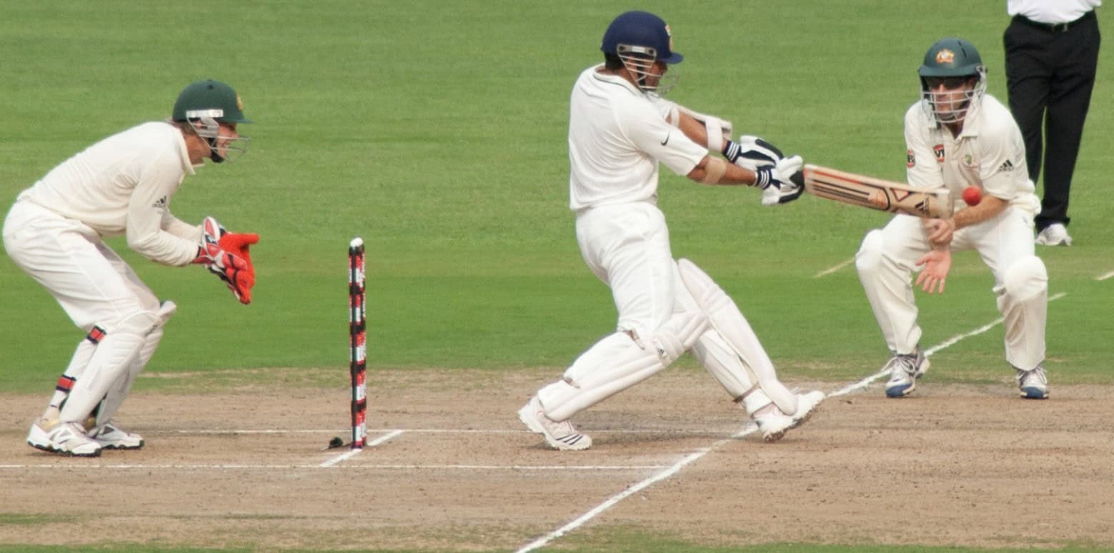
Sachin Tendulkar drives a ball, Bangalore, October 2010 | image By PulkitSinha, Wikicommons
[1] The Ultimate Ball-by-Ball Cricket Dataset
[2] Full toss: a volley; Yorker: lands awkwardly right at the batter’s feet; Full: lands close to the batter’s feet; Good: regarded as the ideal length, giving the batter little time to react; Short: lands further away from the batter – often a bouncer that zips up past the batter’s helmet, rattling them or tempting them to take a swipe.
[3] A wicket consists of three stumps (and two bails). The off stump is the stump on the same side as the batter’s bat when they take position to face the bowler, while leg stump is the stump next to the batter’s legs.
[4] With the big caveat that the underlying dataset for this analysis is incomplete.