A sideways look at economics
Brace yourselves: econometrics follows.
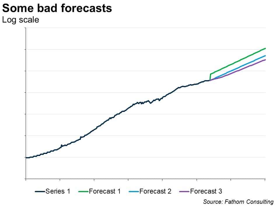
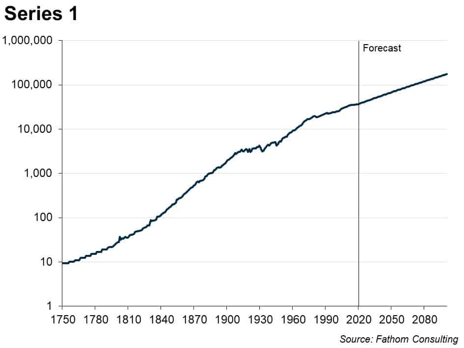
Look at this time series. What happens next?
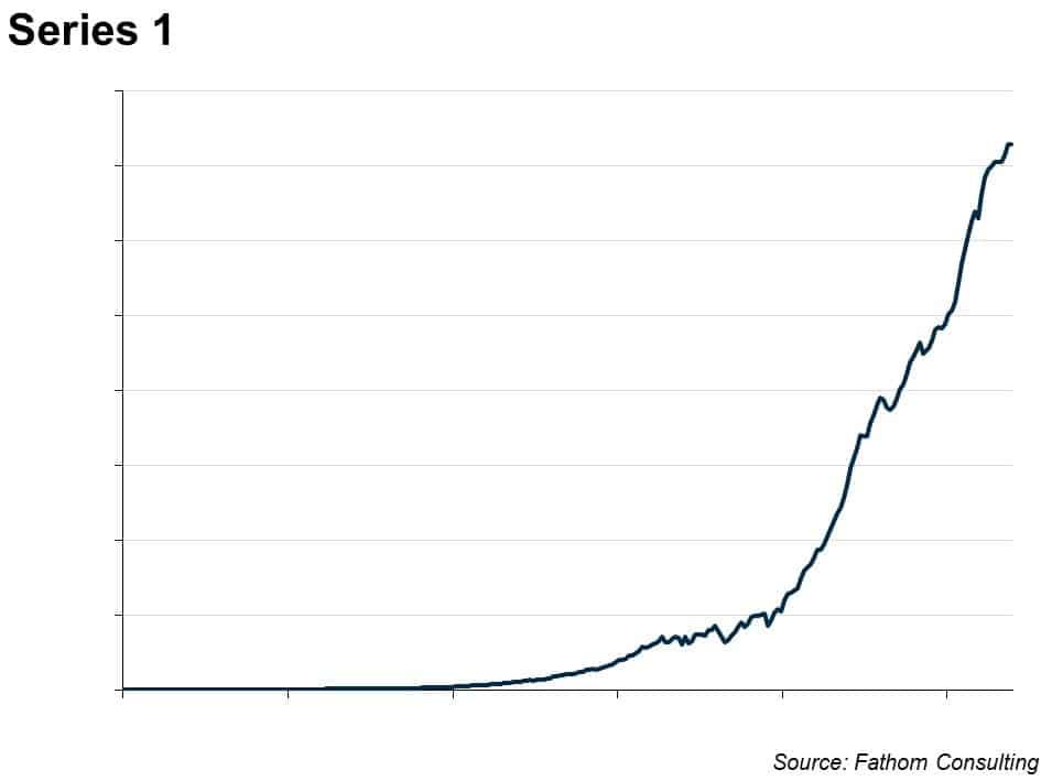
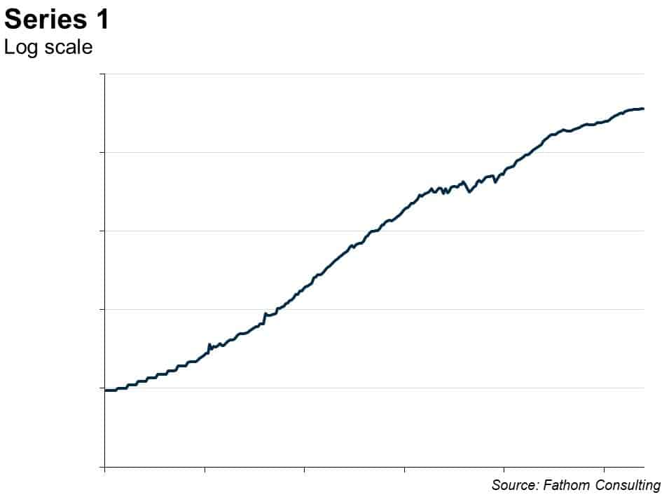
Many macroeconomic time series look a bit like this. They are trended, but wobble around in interesting ways compared to that trend, and for long periods of time. You can see that by eye — and it’s even clearer if you put the series on a log scale, thus:
How would you go about forecasting this time series? Well, you might start by estimating the trend in the logged version, like this:
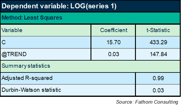
It turns out that series 1 grows by an average of 3% in each period, according to that equation. So you could simply extrapolate that trend: it will continue to grow at that deterministic rate, indefinitely. However, the equation leaves a great deal to be desired. In particular, the Durbin-Watson statistic is far outside the tolerance interval (between 1.5 and 2.5), indicating that there is a lot of stuff going on with series 1 that is not captured in the trend. You can see that if you plot the residual, the unexplained component:
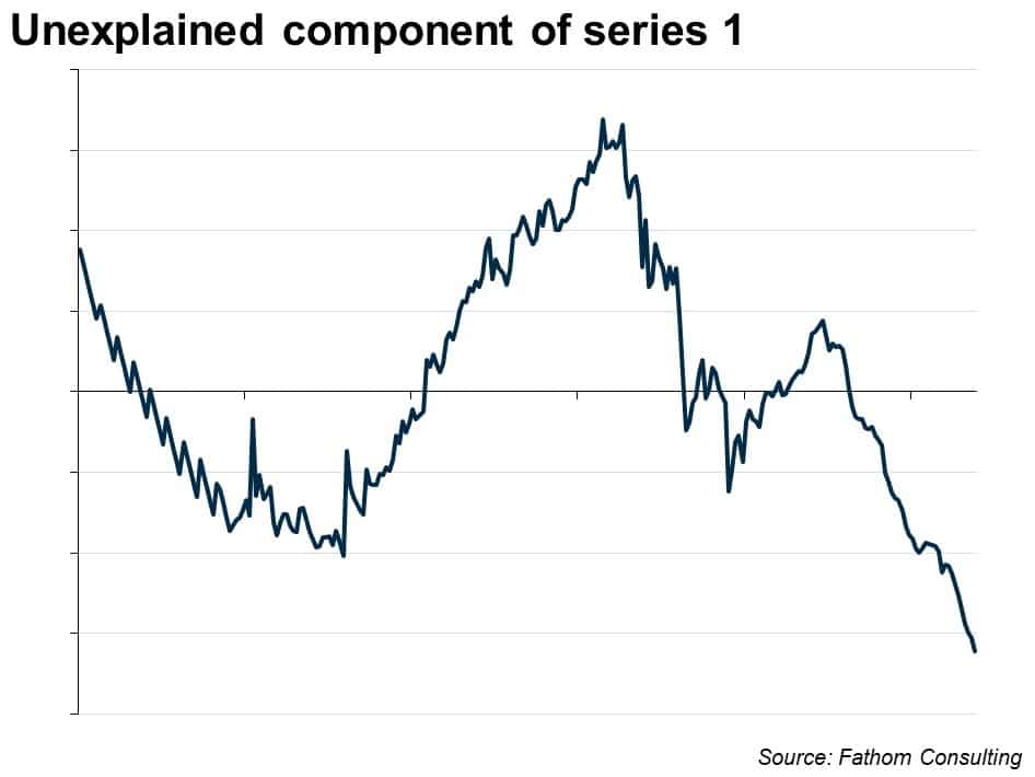
The residual is ‘non-stationary’: the mean over the whole period is zero, but it shifts up and down in persistent and interesting ways. We need more than just a trend to explain it. The next step might be to take the first difference of the logged series, which looks like this:
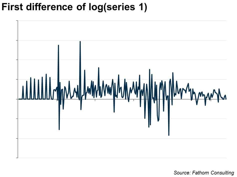
There’s no trend in that series. Maybe this differenced series is what we should try to forecast. How? Well, you might start by finding the mean. It is just over 3%. So we wind up with a similar extrapolation as above — the series will continue to grow at just over 3%. But we don’t have to stop there: maybe the differenced series will allow us to get hold of some of the interesting dynamics, the wobbles around that trend. Econometrically, the way that works is by looking at how the current value is influenced by past values of the series, or by past values of the unexplained element of the series. The name for this kind of model is ARIMA (which stands for auto-regressive integrated moving average). In this case, it comes out thus:
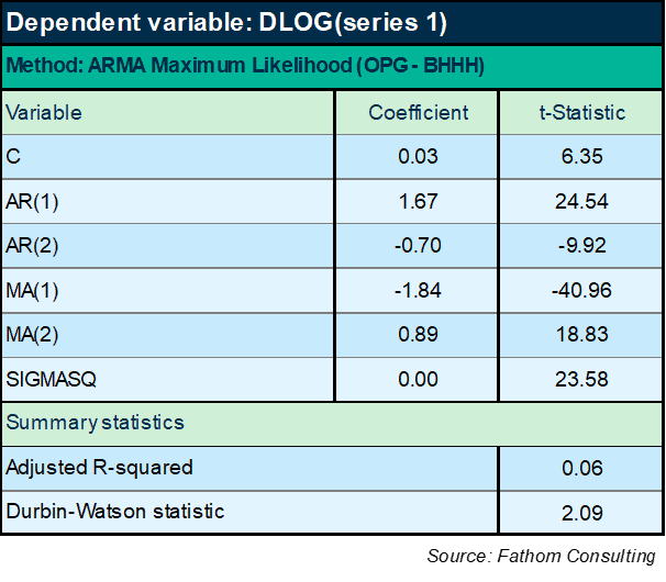
You can immediately see that the DW statistic is much improved, well within the tolerance intervals. But the equation specified in this way explains less than 6% of the variation in the first difference of the log of series 1. It’s pretty much just the mean and then a tiny fraction of the remaining variation that’s being explained. Maybe that’s the truth of the matter: maybe there’s nothing more we can do.
If we knew nothing about what this series actually was and what it meant, then the literature suggests an ARIMA type approach should be the best way of forecasting the series. But, looking back at the pattern of residuals in the first equation, it feels like we must be able to get hold of those long-lasting cycles somehow. So let’s try another approach, which is to specify the equation as an equilibrium correction mechanism (ECM), like this:
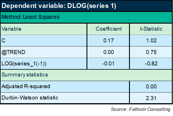
Hmm! Well, that didn’t work! The explanatory power of a model that puts the lagged level of series 1 on the right-hand side along with a time trend is lower than it was for the ARIMA model above. OK: maybe I should include the ARIMA terms too, like this:
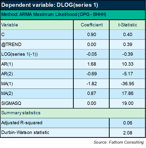
Again, not brilliant. I’m now explaining a not terribly massive 6% of the variation in the difference of the logged series. Moreover, the lagged level term is not significant — not even close, according to the t-Statistic (which has to exceed an absolute value of 2). Must do better, as my economics tutor might have said (and often did). For what it’s worth, the forecast looks plausible — that’s forecast 3 in the chart below, compared to two other forecasts based on the previous two models. But the model is very poor in all cases, so the forecasts are not reliable.
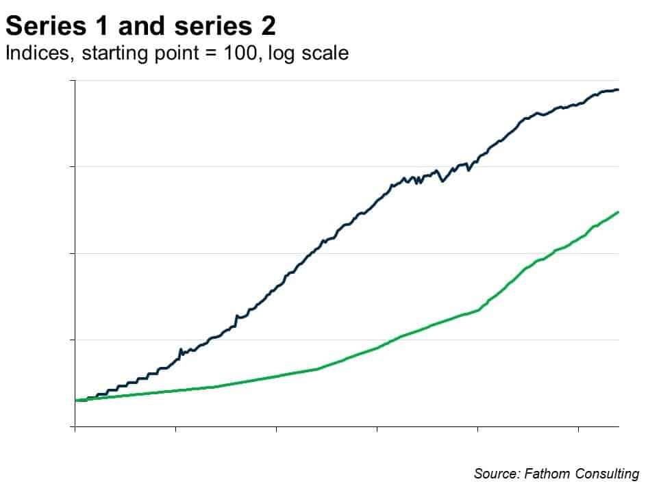
So let’s try bringing in any other information I have. Suppose I ‘know’ something about this series. Suppose I have a strong prior that series 1 is ‘caused’ by series 2, at least in part. Here are the two series plotted together, on a logarithmic scale, both indexed to equal 100 at the start point.
Right, that looks promising! Let’s go with that:
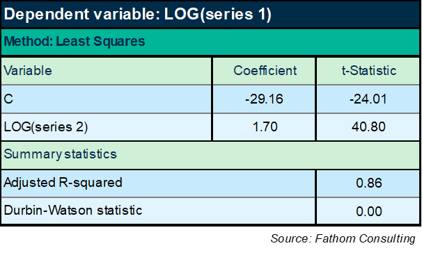
We’re starting to get somewhere now. There’s no doubt that series 2 is significant, right? Enormous t-Statistic. And we’re explaining 86% of the variation in the log of series 1. But hold on a moment: the DW statistic is tiny — lower than it was when all we were using was a time trend. Huh? And the explanatory power of the equation is lower than it was then, too. OK, maybe I need to add the trend back in:
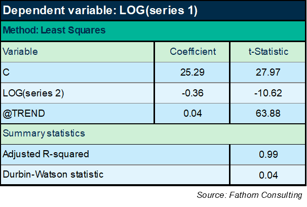
Bingo! Massive improvement in explanatory power. But wait: the DW statistic is still terrible and, even worse, the sign of the coefficient on series 2 has changed from positive to negative. We’re firmly in ‘spurious regression’ territory here: I can generally explain any non-stationary series with any other non-stationary series (the birth rate with the population of storks, for example) if I specify my equations like that.
The flipping of the sign demonstrates that the relationship I have found is spurious. I know that series 2 causes series 1 and, what’s more, I know the relationship is positive! This equation will not do. It violates my priors too much. And there’s loads of missing information still.
Let’s switch approach and do this in an ECM framework again, to avoid the problem of spurious relationships, and to try and get hold of some of the dynamics as well as the long-run relationships. No, that’s no good either. Turns out that however I slice this, even loading in all the AR and MA terms, and whether I use a trend or not, the long-run impact of series 2 is always negative — which I know cannot be the case. The equation set out below is one example, but they all look much the same.
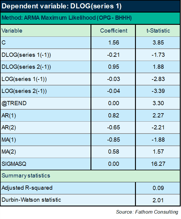
No, this structure fundamentally does not work. OK: I need to try something else. And it seems like, whatever I try, I will need to insist on my prior view of the long-run relationship. How about something like this:
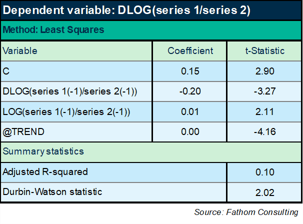
Now we finally seem to be getting somewhere. If I look at the ratio of series 1 to series 2 over time, it turns out it has a negative trend and some interesting dynamic effects too. The equation has a slightly more respectable explanatory power of 10%. A decent DW statistic. All variables are significant and ‘correctly’ signed. The only sign here that could be incorrect is the sign on the lagged level of the ratio, which has to be negative or else the equation is mis-specified as an ECM, as any fule kno.[1] Oh, but wait: the coefficient on the lagged level term is positive. Hmm. I wonder what happens if I reduce the sample period:
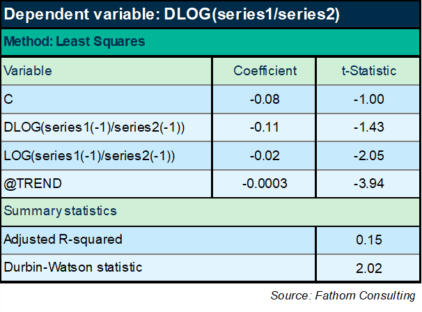
Right, that works! The ratio of series 1 to series 2 converges, very slowly, on a very gradual declining trend. Looking good. Let’s forecast series 1!
Oh.
The problem now is that to forecast series 1, I have first of all to forecast series 2. Hum. Well, that’s do-able: a quick ECM model of series 2 will do the job.
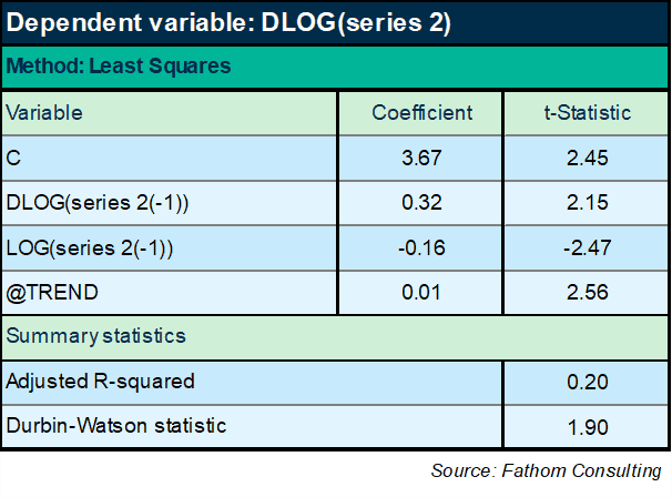
Works pretty well: series 2 converges on a deterministic time trend in the long run. Right, armed with this equation and the preceding one, I can now return to the original question: what happens next? We are now in a position to forecast series 1. The chart below plots that forecast.
That forecast looks sensible, right?
Wrong.
Series 1, if you hadn’t already guessed, is global emissions of CO2. Series 2 is global GDP (smoothed) in constant prices — both series going back to 1750. The process outlined above results in a plausible model and a plausible forecast, except in the rather important sense that if that forecast comes to pass, and the climate science is correct (and I have no basis on which to doubt it), then we are all dead. One way or another, that forecast will not come to pass!
The relationship between carbon emissions and GDP is such that the ratio will tend to fall very slowly over time, as we become more carbon efficient. However, as the IPCC has predicted and previous Fathom research has confirmed, the rate at which we become more carbon efficient needs to increase, sharply, starting immediately. A change in regime is coming of just the kind that the Nobel Laureate Robert Lucas[2] drew attention to in his work — a change which will upset any econometric models based on pre-existing data. The model estimated here might have worked in the past, but it will not work in the future.
[1] Catchphrase of the ineffable Nigel Molesworth in Down With Skool by Geoffrey Willans and Ronald Searle.
[2] Robert Lucas won the Nobel Prize for Economics in 1995 for his work developing the hypothesis of rational expectations, and is also well-known for the so-called “Lucas critique” of macroeconomic models: https://www.nobelprize.org/prizes/economic-sciences/1995/press-release/